10 Examples of Great Website Design
The best websites are the product of smaller design and development decisions. Your website is the first point of contact for many of your customers or clients.
A bad website turns customers away, whereas a good one reels users in with the homepage and then delivers engaging, relevant content in the remaining pages — all with the intention of enticing audiences to buy products or enroll in your services.
In this article, we’ve listed 10 examples of excellent web design to inspire you for your next project:
1. The District
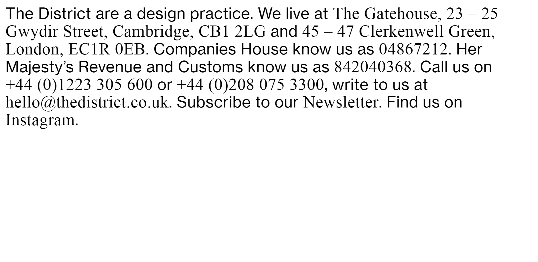
The District is a design agency. Rather than a generic website, its homepage is a clutter of addresses, contact information, and social links.
At first glance, most readers are probably confused about why a design agency’s website is so drab and messy. But the thing is, this minimal design intrigues users. It makes them want to find out what is going on.
It also shows off The District’s creativity and artistic uniqueness. Instead of opting for a sleek, high-visual design homepage, it hooks users in, delivers crucial information, and showcases its work when users scroll down.
2. Galleon and Caravan
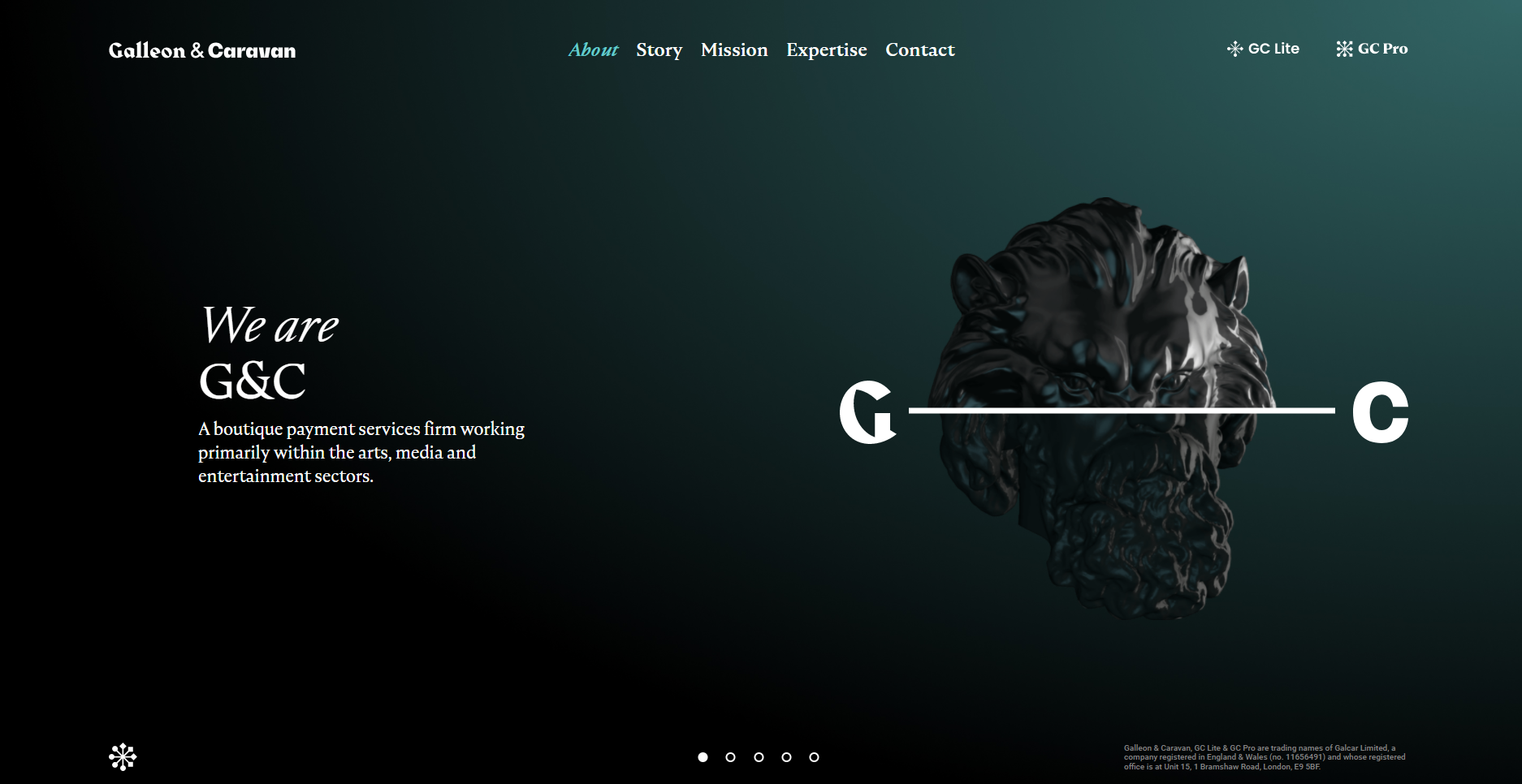
Galleon and Caravan’s website will have you believe it’s another design agency, but it’s actually a boutique payment services firm with some serious web design chops. For one, the entire website is on one page.
The homepage stays still when a visitor scrolls down, but the text and animated figure change. The dark colors add an aura of elegance and artistic flair to this seriously stunning website.
3. BetterNurse
While the examples above are immediately enticing, it’s important to remember that your web design must reflect your website’s primary purpose.
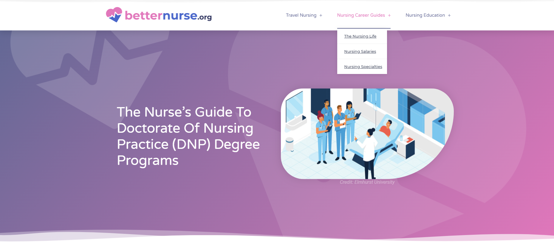
BetterNurse is a resource in nursing that has guides on programs for nursing degrees, jobs, and lifestyles within that industry.
This website reflects its goals. There’s a clean, minimalistic tone throughout with splashes of color. You won’t find anything extravagant, just an educational website with great information architecture and easy-to-read guides.
This might seem boring to some, but remember that this is what the company aims to do. It doesn’t want to wow users. It simply wants to provide information effectively for its target audience.
4. Moat
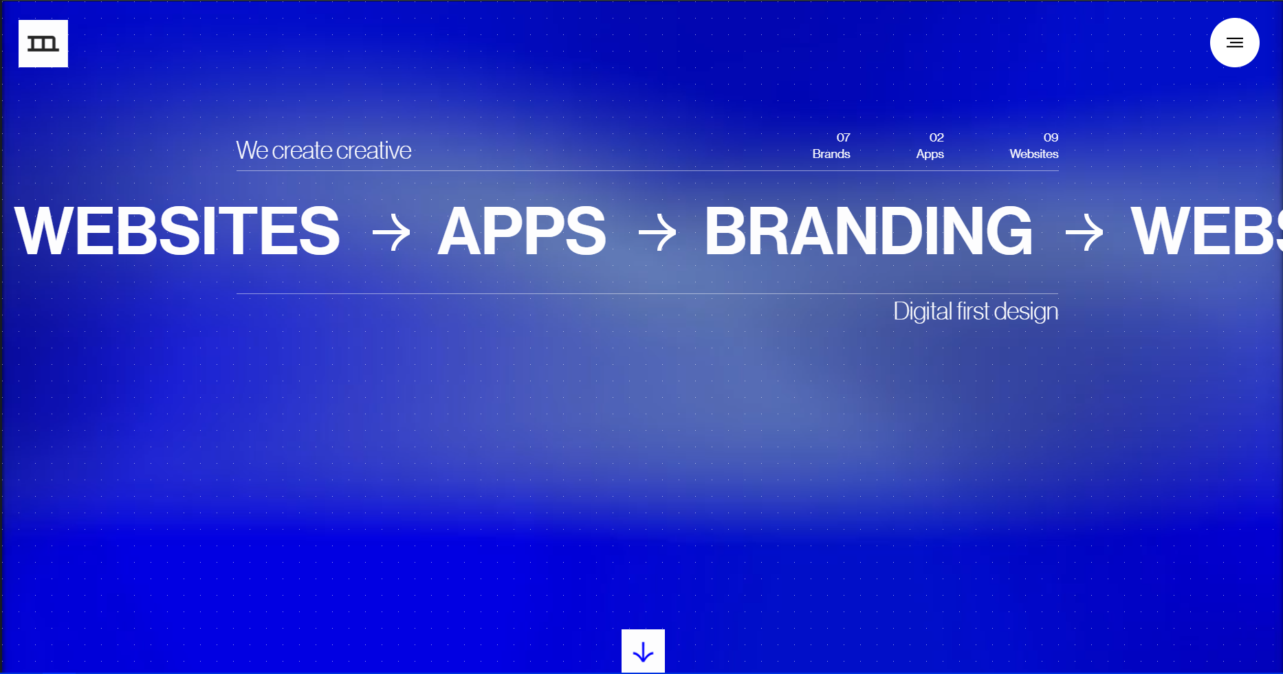
Moat Design is another design agency that keeps it simple, intriguing, and straight to the point. Reminiscent of old-school ticker ads, Moat’s homepage highlights its main services. Users can click on the button at the top right to access other pages or simply scroll down.
You’ll also notice that the background for the homepage is similar to a Dot Grid, often found in design notebooks, journals, and other online tools. This is a simple homage to Moat’s craft that customers will likely appreciate.
The rest of its website is equally minimal, with the main focus being on the work.
5. Preply
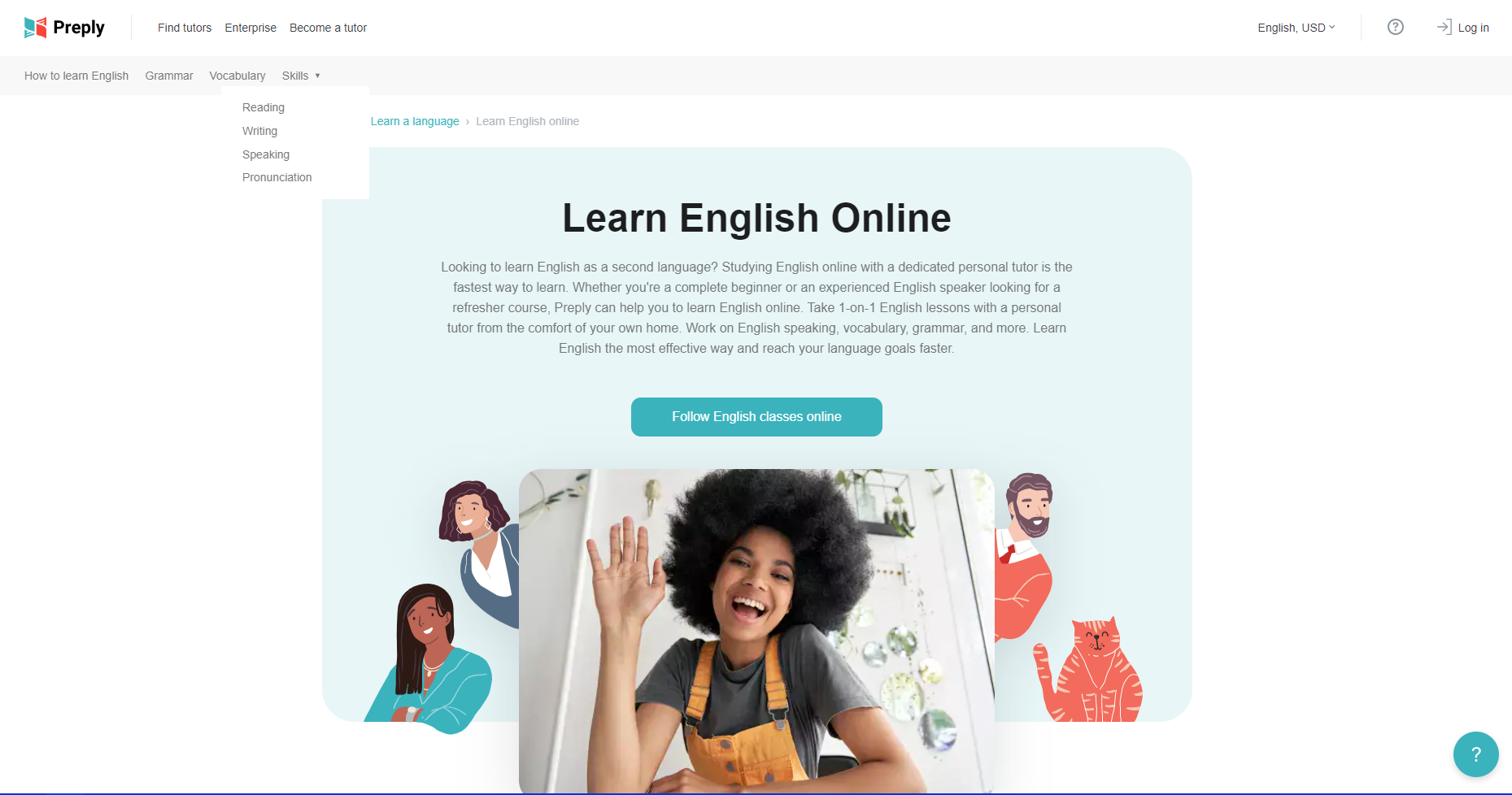
Web design goes beyond the homepage. Every page must serve a purpose, and Preply does just that.
Take its parent page for learning English. It’s designed in a way that non-English speakers can easily navigate, using simple wording to guide users.
“How to learn English,” “Grammar,” “Vocabulary,” and “Skills” are at the top left of the parent page, so users can find exactly what they’re looking for.
This parent page is also great for Search Engine Optimization (SEO). It targets keywords that someone trying to master English would use and has links to multiple internal pages.
6. Planetary
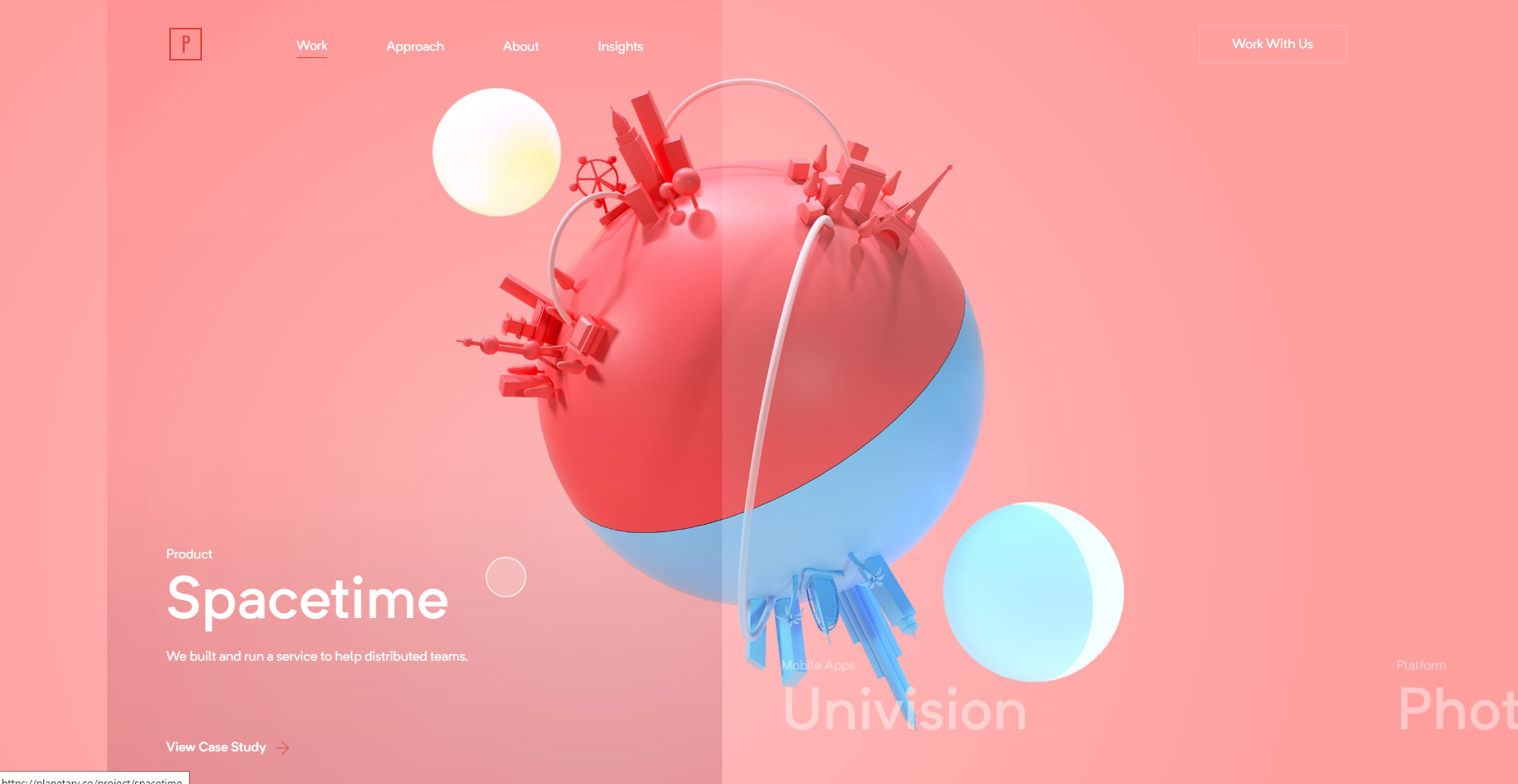
Planetary is a top digital studio that delivers products for startups and MNCs alike. Its homepage starts with a standard gray background and white text. But when the user scrolls, the magic begins.
The page scrolls horizontally to showcase Planetary’s work and fully transforms to match each project. For example, the image above shows the page changing to match Spacetime — an app that helps remote workers and teams.
This is a great way to grab user attention and put the spotlight solely on the work that this studio has done.
Apart from the stunning visuals, links to other pages like About, Approach, and Work With Us, are always present right at the top. These web pages are more minimal and focus on well-written text.
7. Agorapulse
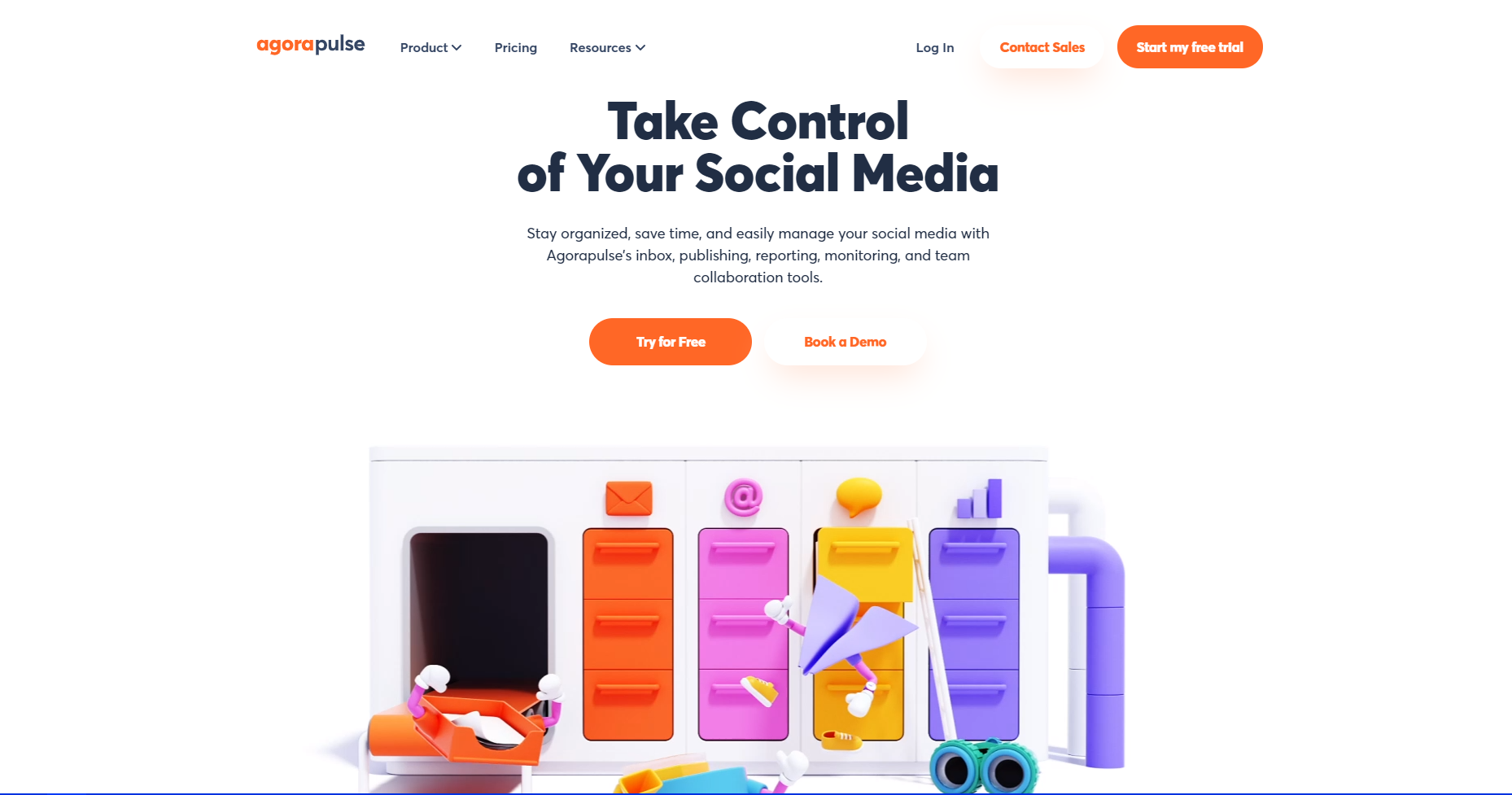
Agorapulse is a social media management tool that mixes business and fun with its website. While the top of the homepage is mostly white and focused on product features, the bottom plays a short, bright cartoonish video that explains the product.
The theme of colorful visuals complementing concise copy continues throughout this website. Social media management tool features are not the most exciting to read about. Adding visuals to the process lightens up the page and keeps readers hooked.
The information on each page is well segmented and easy to understand. It’s also worth noting that the visuals add to the information rather than distract from it.
8. Ultimate Meal Plan
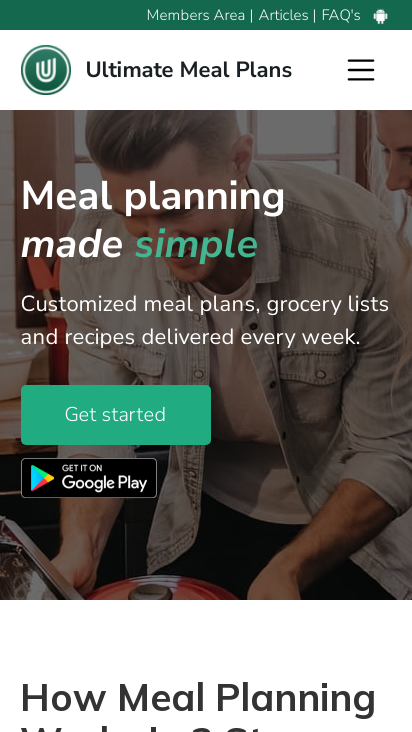
With 29 billion current unique mobile phone users, responsive web design has become essential. Your website must seamlessly transform to suit both desktop and mobile users without losing any functionality.
Ultimate Meal Plan gets this right with its mobile website. The meal planner condenses its desktop homepage into a minimal, bright, easy-to-navigate mobile site.
The options listed atop the desktop website are moved into a menu at the top right of the mobile screen. This removes clutter and keeps users focused on the content that matters.
The visuals on each desktop page are also effectively scaled down to replicate the minimal and professional vibe.
9. Early Bird
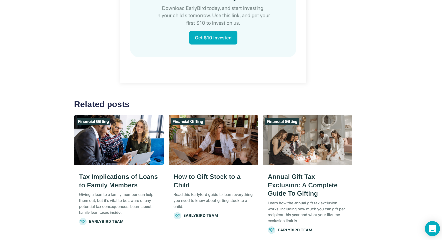
Web design doesn’t just make your website look good and function well. It also plays a crucial role in content marketing and SEO.
Early Bird allows families and friends to invest in a child’s financial future. It has a minimalistic website that even the most technologically-challenged family member can navigate.
The web design helps Early Bird’s SEO efforts on the blog pages. Its blog post on gifting money to family members, for example, lists related posts at the bottom. This keeps users on the website for longer by providing more helpful information.
Adding related posts also creates a web of internal links that search engines love and boosts web traffic to internal pages.
10. Nlyte Software
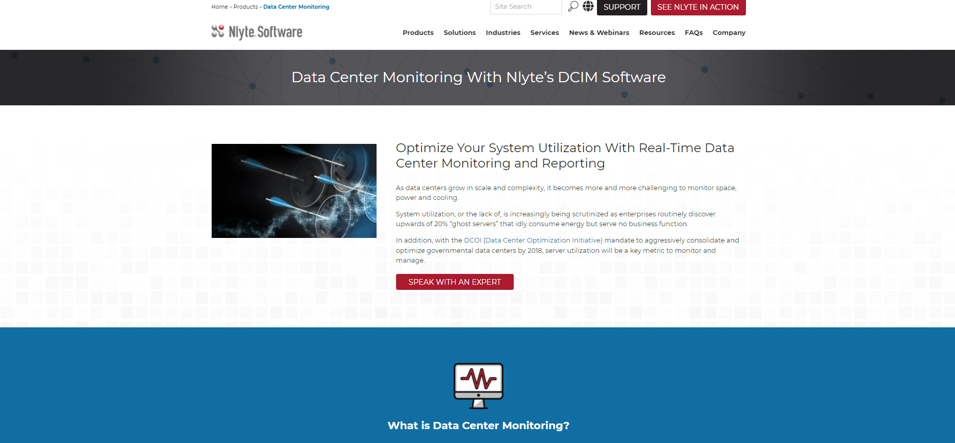
Web design for industrial companies and back-end businesses can be challenging since the subject matter is typically complex. In addition, it interests only a few people, and these people are either newbies or those with genuine knowledge about the topic. The content must cater to both.
When creating a web page for these topics, it’s important to make the content as readable as possible.
Take the above page about data center monitoring, for example. It hosts a ton of information. However, rather than lumping it all together, the content is effectively divided using images, different colors, and precise sectioning. This makes it easier to read and understand.
Even as you’re scrolling down to read more, the main header with the company logo, product links, and contact information is always at the top of the screen. This makes it easier to generate leads.
Conclusion
A website can be as colorful or minimalistic as a designer pleases, as long as it caters to the target audience of that website. We hope the web design examples we shared above have inspired you to create stunning web pages of your own.
You can learn more about web design, SEO, coding, and hosting on our blog.