CSS Flexbox

If you’re learning CSS, I’d suggest you check this CSS Tutorial first.
The flexible box (flexbox) is a CSS3 layout that is one of the most used structures for creating responsive websites.
Apart from being mobile-friendly, it is supported in all browsers, and using it is a breeze.
So, if you are ready to harness the power of flexbox, let’s go!
Anatomy of flexbox
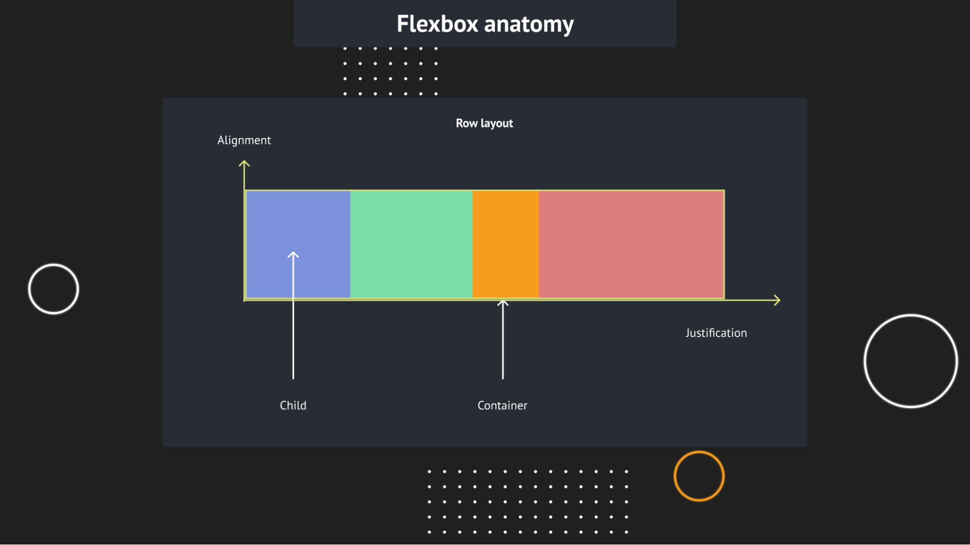
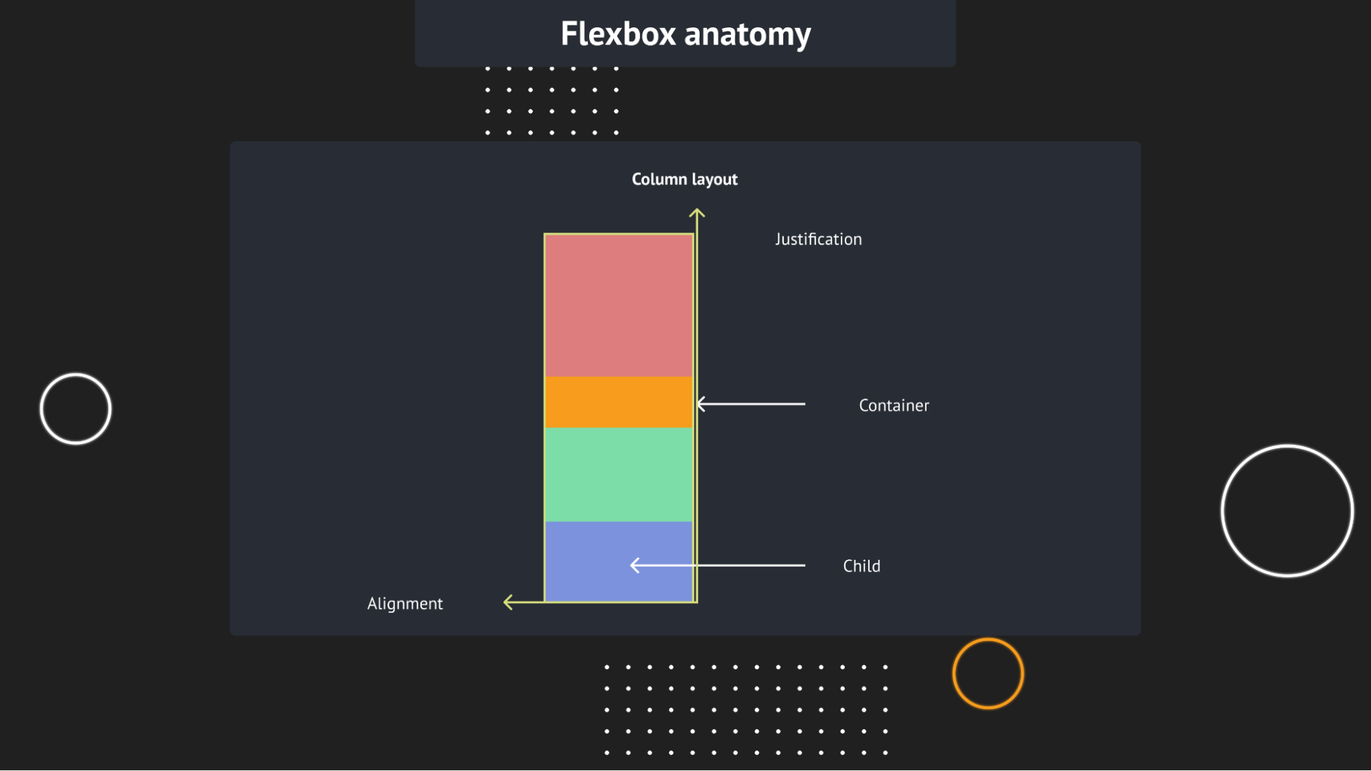
To understand alignments and justification of the content later in this guide, we have to get familiar with the flexible box model.
It always has two axes one for justification and another for alignment.
Row layout
It is the default arrangement of items in the container. Similar to an inline layout, it puts all children in a single row.
Column layout
The column layout places all of the children under each other. It resembles the row above, but it is rotated by 90 degrees. So the best way to memorize the difference between row and column is by switching the names of the axes 🔄️
Differences between Inline and Flex
Although a flexbox and an inline layout take up only the necessary width by default, you can set the length of a flexbox, unlike an inline container.
Another significant contrast between the two structures is the ability to hold block elements. Flex can contain any kind of display, but inline can’t operate with blocks.
Container properties
Now you got to know the differences between inline and flexbox containers. Also, we have seen the anatomy of the flexbox layout.
Let’s see the methods for organizing children within the container by modifying its properties.
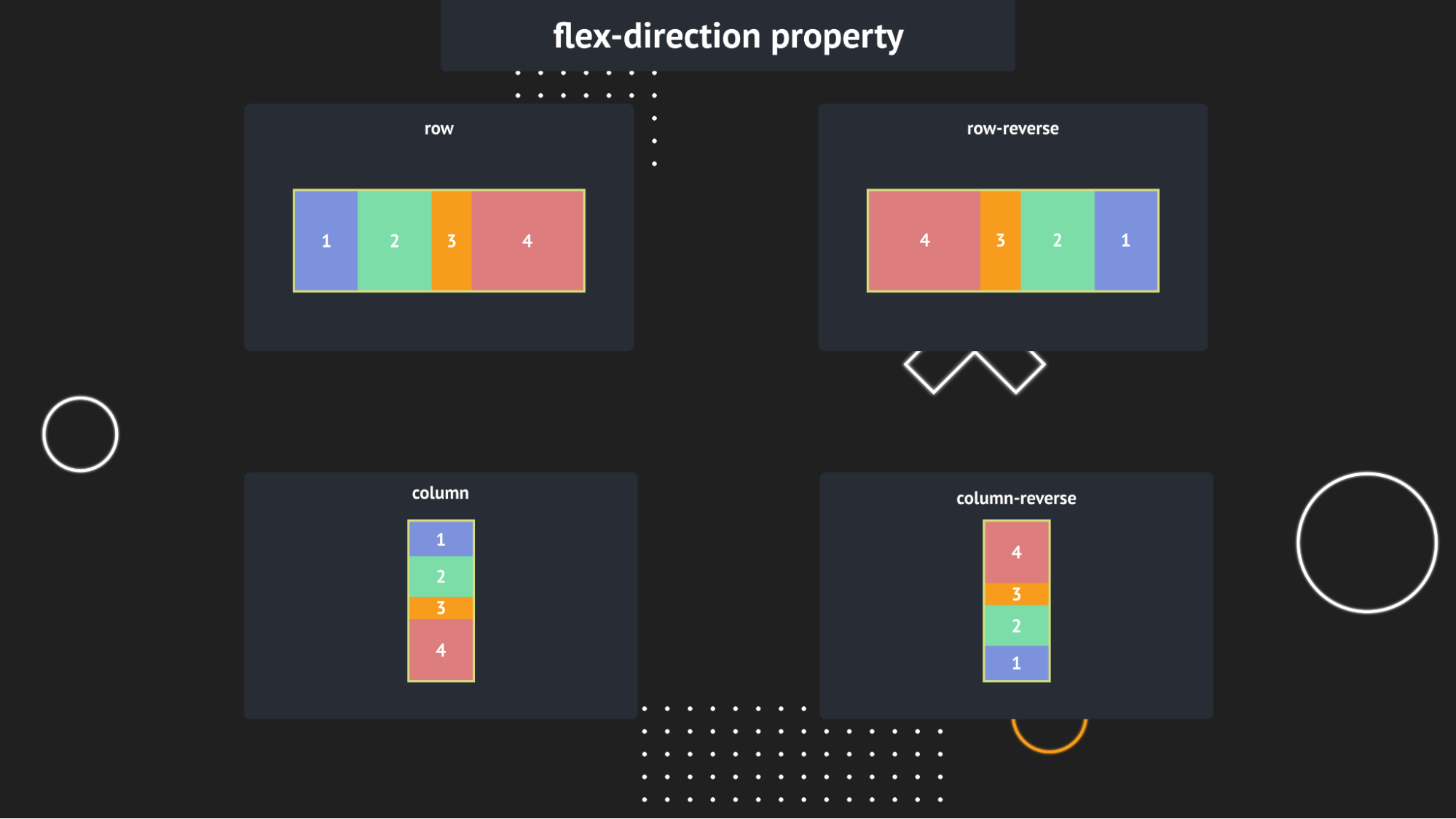
Flex-direction
The flex-direction CSS property is similar to the layouts we have seen above. But there are two additional directions for the placement of children, so let’s see all four.
Align-items
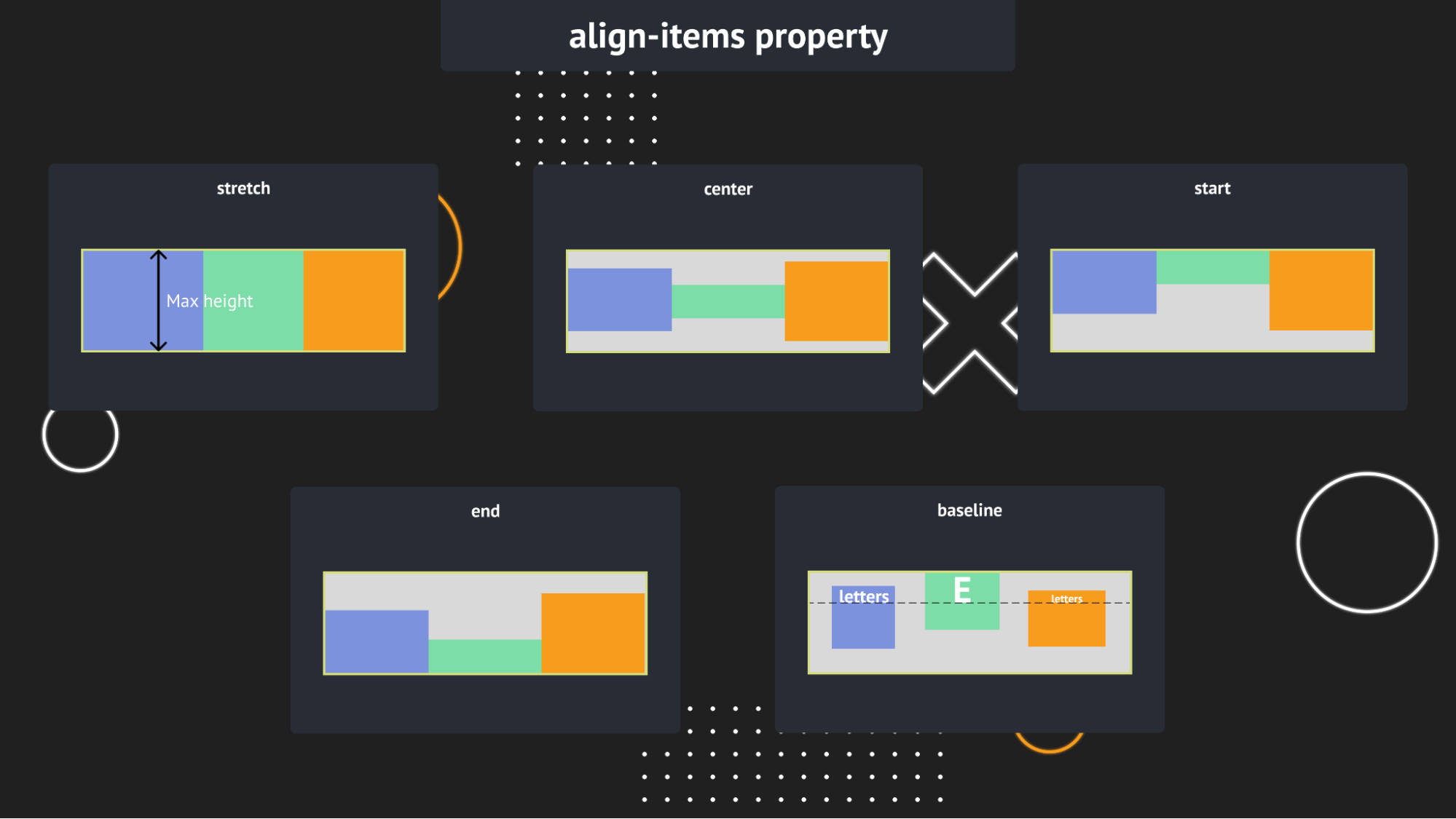
Align-items puts the children along the alignment axis according to the value given to it.
By default, its value is stretch which makes the height (row directions) or width of the children (column directions) equal to the sizes of the container.
Apart from stretch, there are 4 other values:
* center – places elements in the center next to each other
* start or flex-start – packs items from the start of the container
* end or flex-end – puts children at the end of the container
* baseline – loads elements next to each other with their baselines being at the same position
Justify-content
Justfiy-content property determines the way children will be spread along the justification axis.
By default, its value is “start” which packs elements next to each other at the start of the container.
All in all, there are 9 values:
* start or flex-start
* end or flex-end – packs items from the end of the container
* center places items around the center
* stretch – Stretches auto-sized children to fill the container
* left – puts children on the left side of the container
* right – puts children on the right side of the container
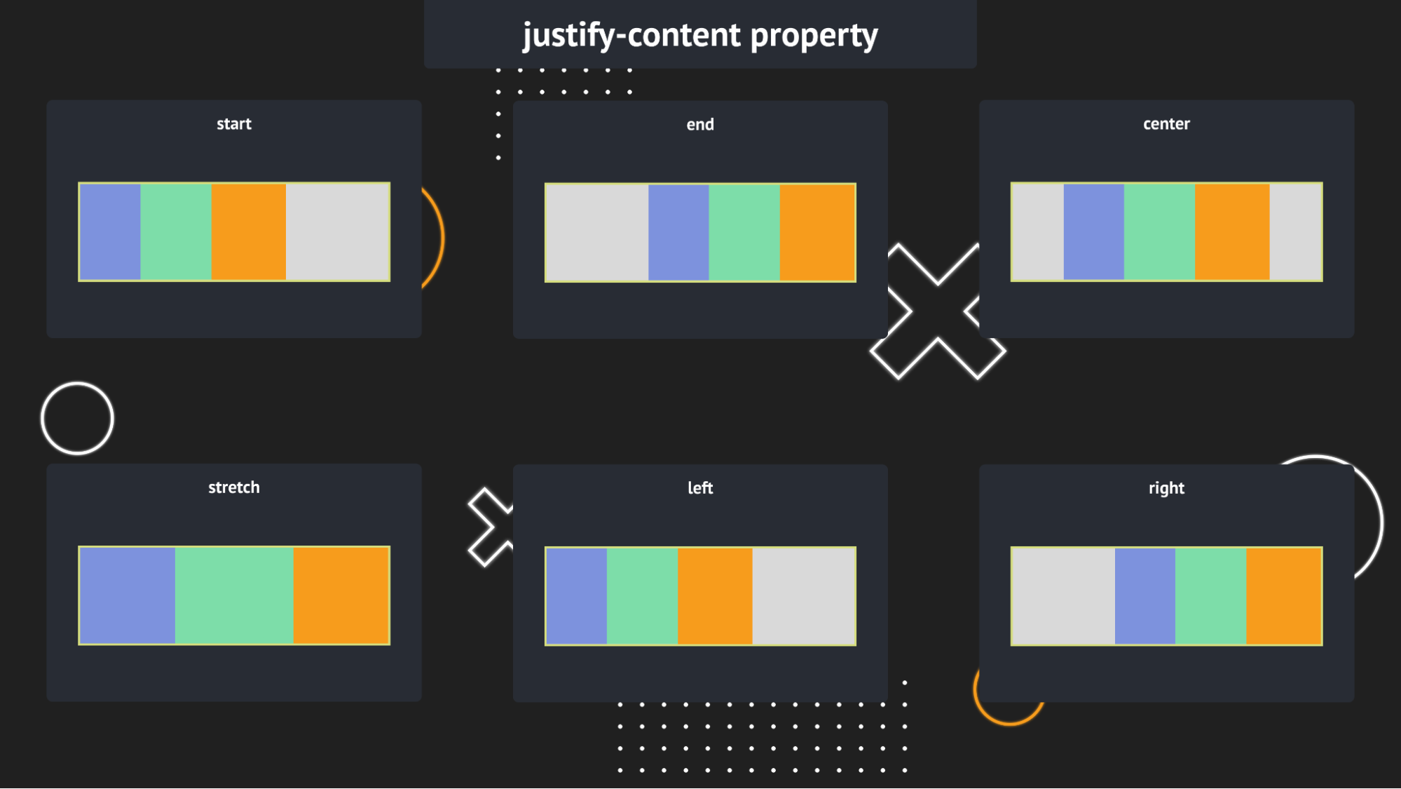
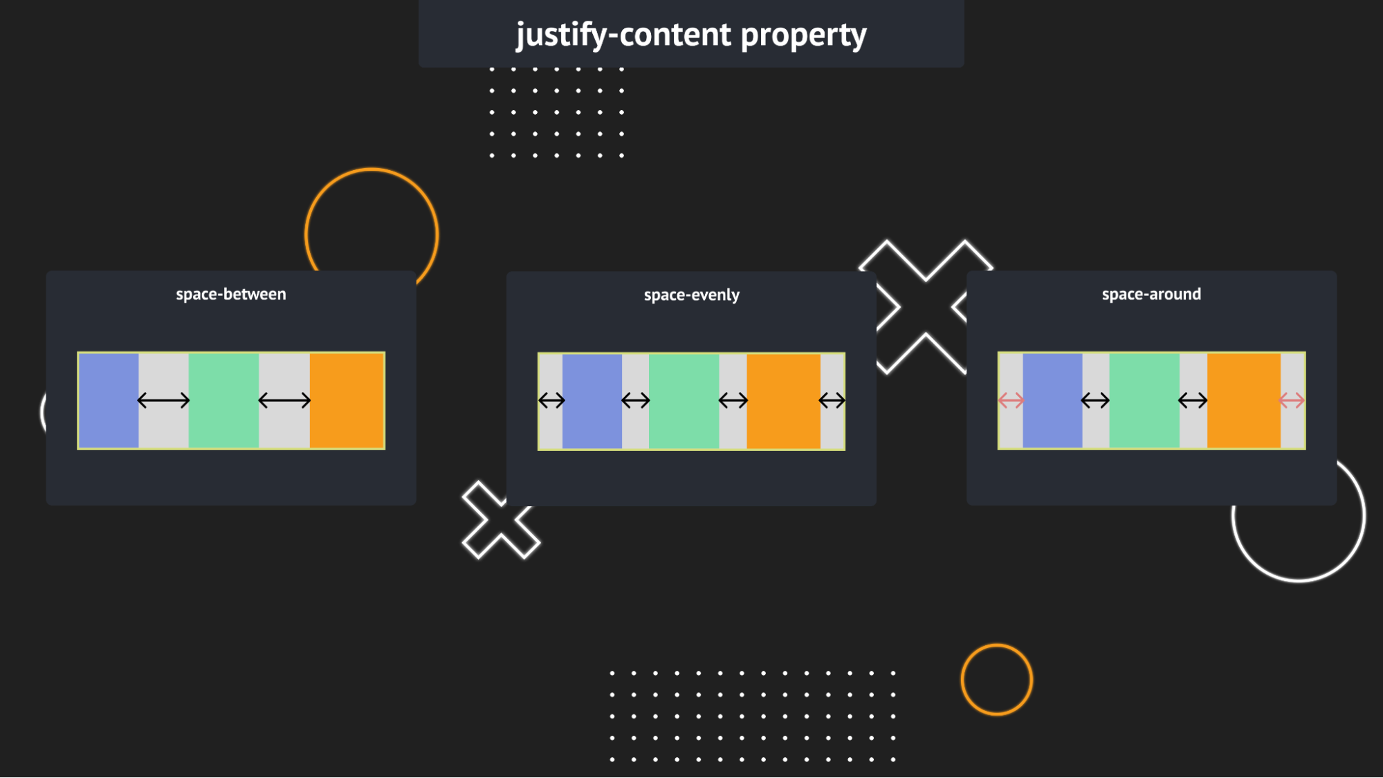
* space-between – puts the first item at the start and the last at the end and separates every object with an identical space.
* space-evenly – divides children with the same size of space from each other and the edges of the container
* space-around – distributes elements evenly having half-size space on both ends
Align-content
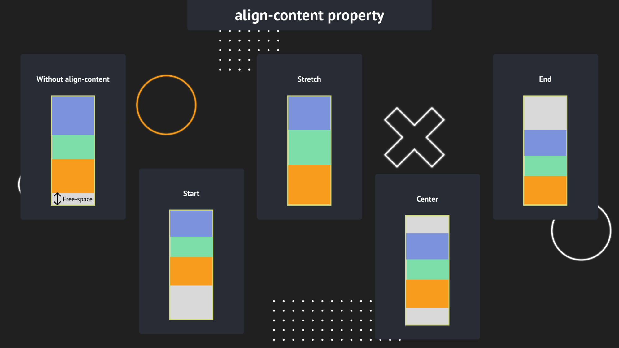
It helps to align the flex container’s lines within it when there is extra space in the alignment axis.
It only works if there are multiple lines along the alignment axis.
Just like the align-items property, its default value is stretch.
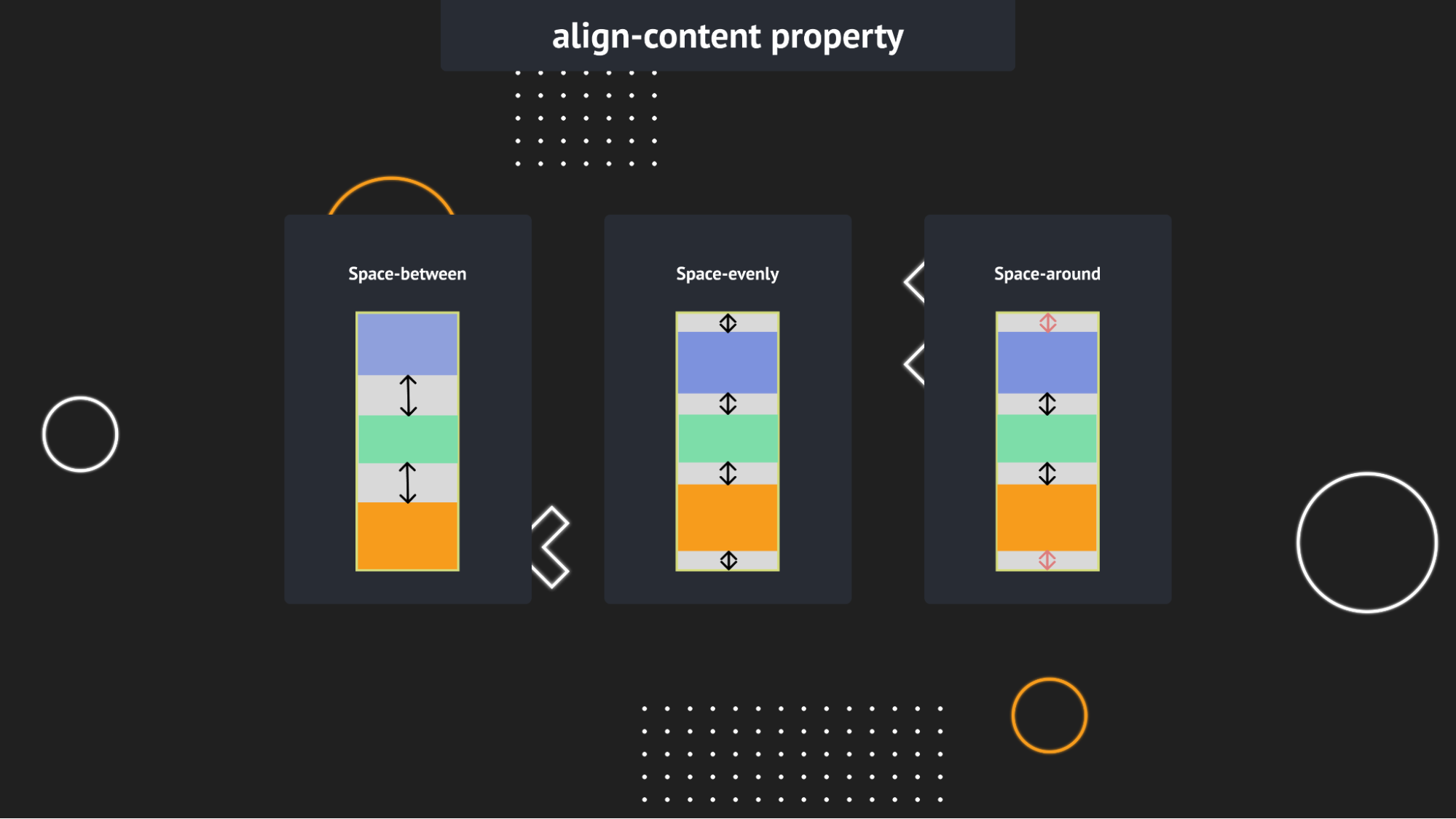
Excluding it, there are 6 different values:
* center
* flex-start or start
* flex-end or end
* space-between
* space-around
* space-evenly
Flex-wrap
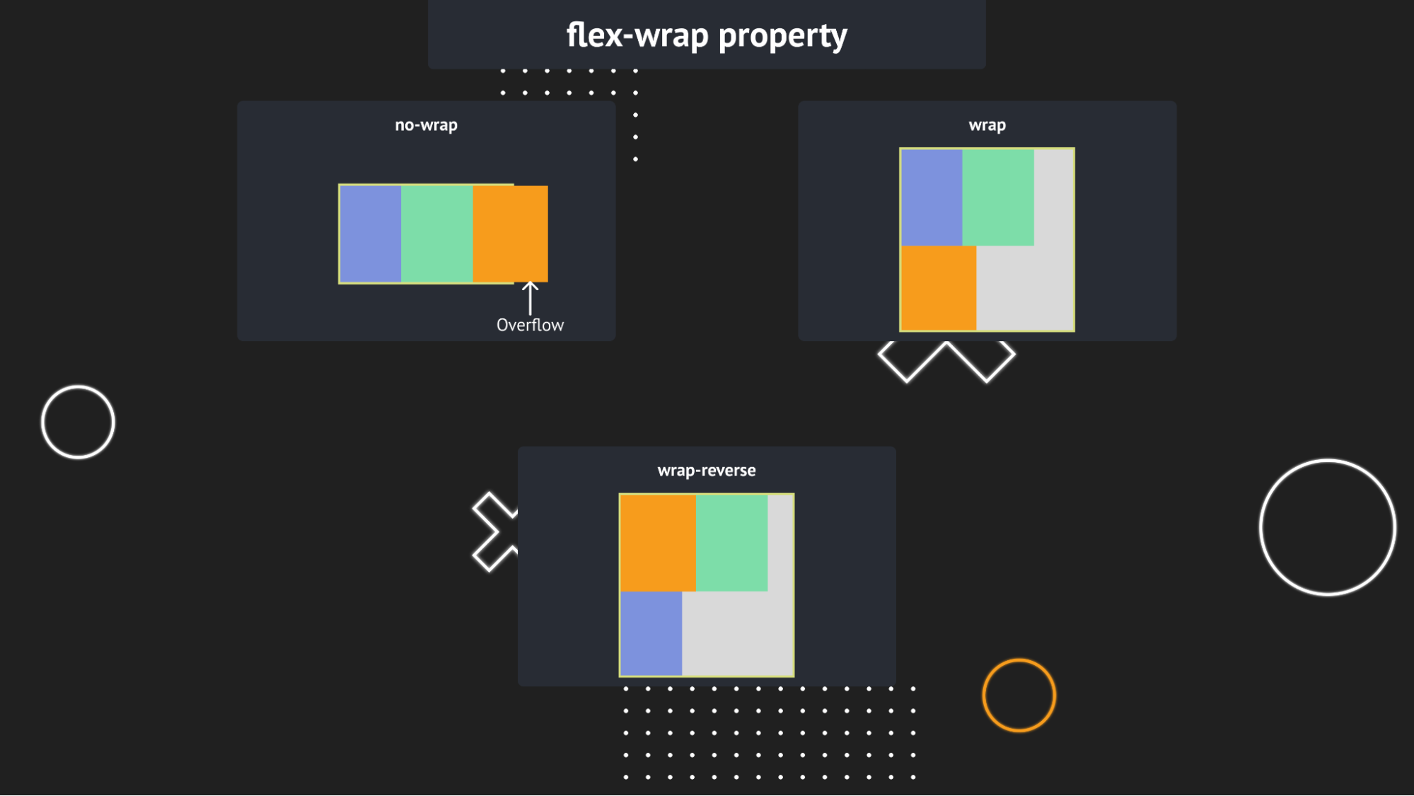
We want to make our website responsive, right? If we decrease the screen width, the flexbox will shrink the items within. To prevent it from messing up our layout, we can wrap the content proportionally to the width with the flex-wrap property.
It has 3 values:
* no-wrap – the flexbox will not break into new lines causing overflow or messy structure
* wrap – creates new rows if the content would overflow
* wrap-reverse – same as “wrap”, but the order of the children is reversed
Flexbox children properties
Apart from changing the whole layout of the container, you can adjust the position of an individual element too.
Align-self
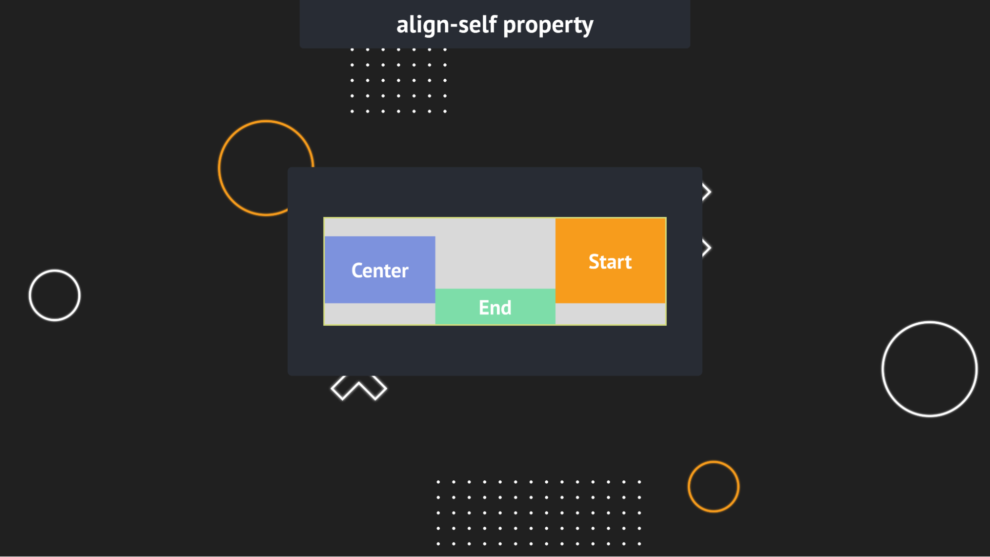
The align-items property of the container sets the align-self of every child. You can modify them one by one, and they have the same values just like align-items.
Order
The order of the children in a container is determined by the HTML code. With the flexbox order property, you can manipulate the DOM with some CSS.
It only accepts integer values up to the maximum number of children. If a negative value is given the element will appear in the first place.
Alert 🚨
The order property shouldn’t be used with non-visual content (e.g. speech)!
Flex-grow
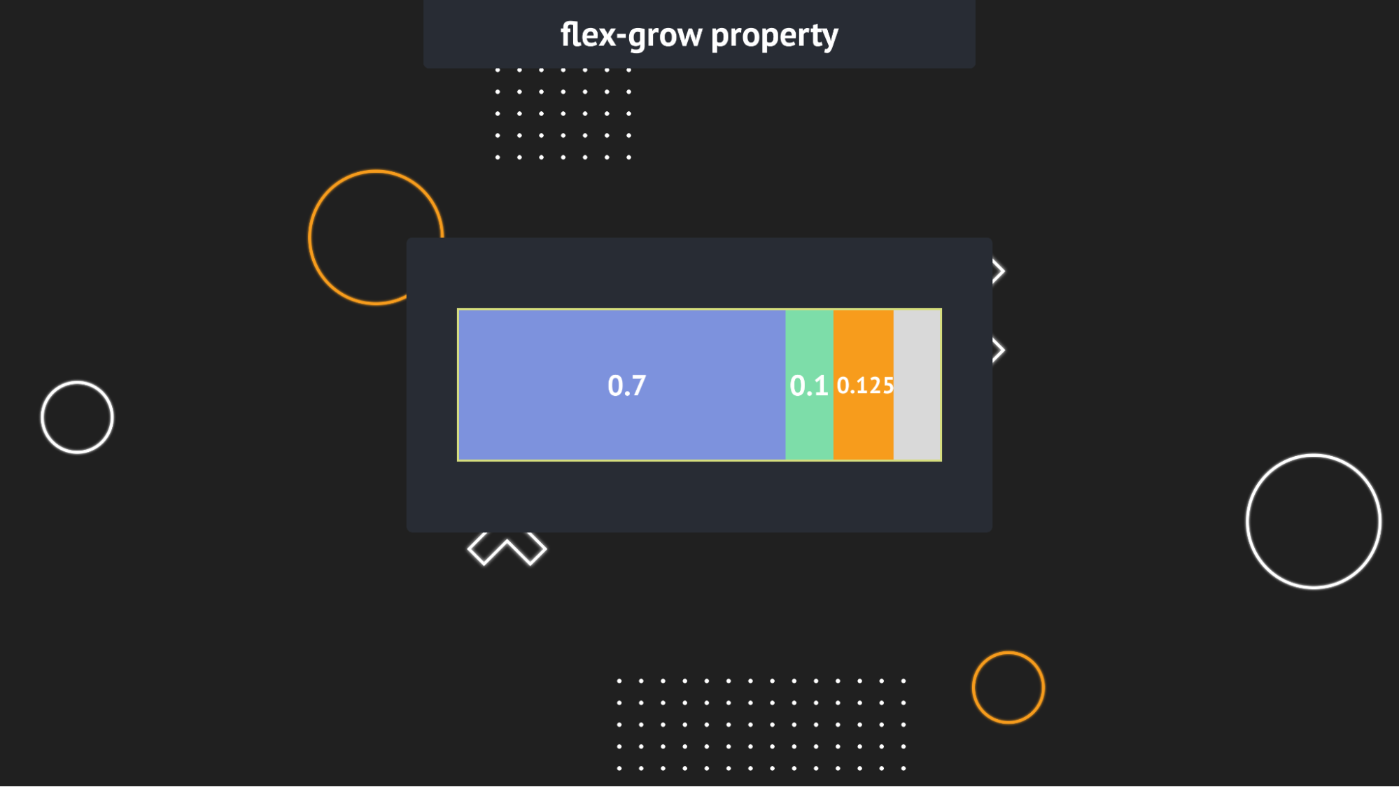
With flex-grow, you can adjust the space taken up by a child. It needs a number (can be a fraction) as a value which must be between 1 (the full size of the container) and 0.
Frequently Asked Questions:
Where should I use flexbox?
Since the flexible box layout is used in web development for making mobile-friendly designs. It the best to use it for creating layouts for sections and dynamically sized elements.
What is the difference between inline and flexbox layouts?
The difference between Inline and flexbox layouts is that the latter can contain any element. Also, it has two axes, one for justification and one for alignment.
With suitable properties, you can distribute items within the container or manipulate individual elements.
Grid VS Flexbox?
CSS Grid layout is used for distributing elements in columns and rows, making more possibilities for layouts. On the other hand, it is much easier to put multiple elements in the center of a container using the flexbox.
I hope you found this article helpful.
If you have any questions or want to get in touch with me, you can reach out to me on Twitter.